
I like to look back on work with a bit of distance, so here, belatedly, are some images of my studio work critiqued in the September seminar. (With the added benefit of being beautifully photographed by Lea Schlatter).
September was a work-in-progress seminar, and additionally it was the seminar in which the part four students had to deliver Oral Presentations. In the short period between July and September my main focus was on creating the presentation, but I wanted to experiment with a couple of ideas, and decided to test out a book format.
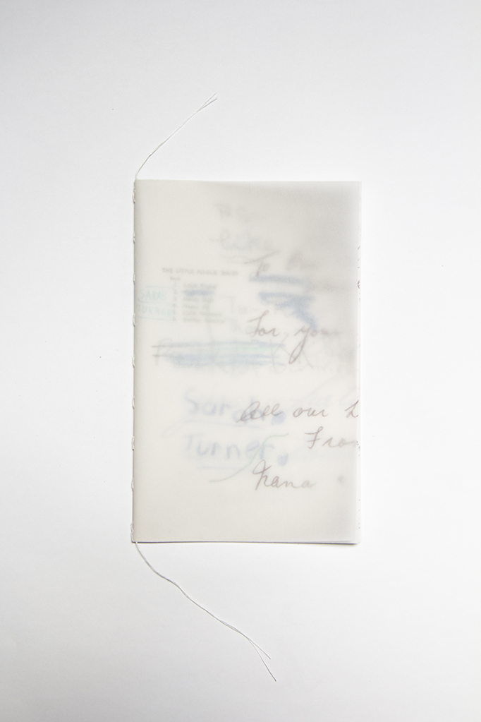
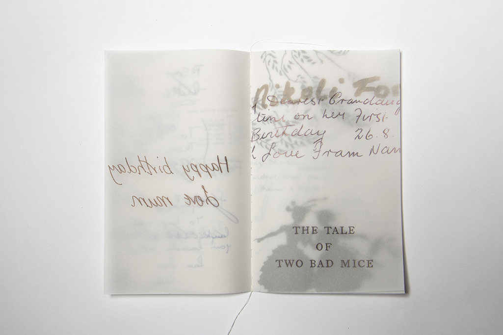
Justine Giles, 2014. Untitled (Book of traces) [ink, ballpoint, coloured pencil, graphite on detail paper, 110 x 175mm (closed)]
The first is a little fourteen page book of transparent paper with book inscriptions (or part inscriptions) on each page. The writing can be see through several layers, though not all of them, which means that as you flick through the book the layered images shift with the pages.
I was interested in seeing what would happen if all these pages that had be altered with handwriting were all together in one place, a concatenation of sentiments, built upon each other, and yet still separate.
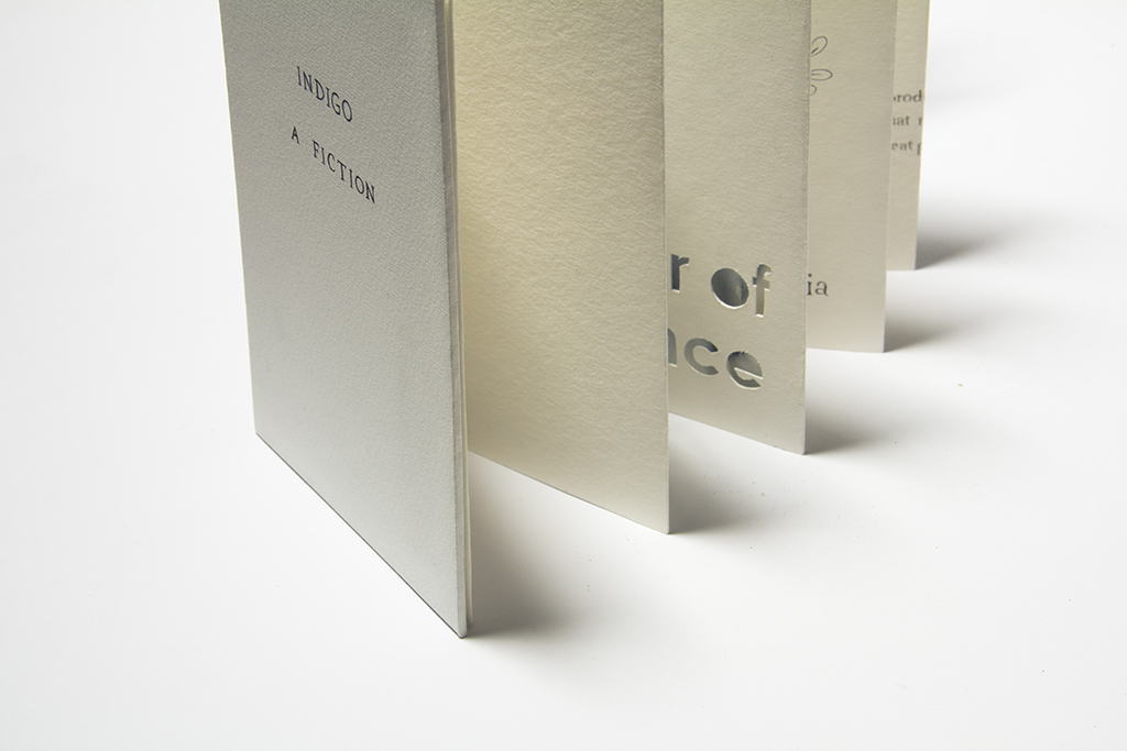
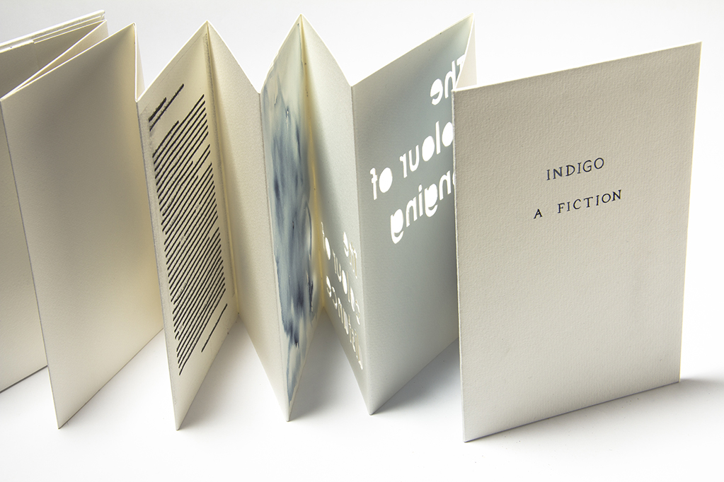
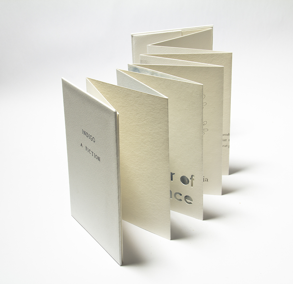
Justine Giles, 2014. Indigo: A Fiction [mixed media, 137 x 205 x 20mm (closed)]
The second book was a different project based on the theme Indigo. I became interested in Isaac Newton’s inclusion of Indigo as a colour in the spectrum and the subsequent controversy over whether it was a unique colour at all. The suggestion being (as I’ve written about before) that he wanted very much to find seven colours in the spectrum (because seven was a significant number at the time) and finding only six he is said to have invented Indigo (named after a dye). It interested me in part because my partner is colour blind and one of the things he has difficulty with is shades of blue, and also because I associated the story in my head with Rebecca Solnit’s Field guide to getting lost where she uses the evocative phrases “the blue of longing” and “the blue of distance” to describe how things at a distance (such as mountains) seem blue, but are no longer blue when you reach them.
I loved the idea that Indigo could be the colour that sits between reality and fiction, known, visible, but somehow contested anyway.
—–
The books were a misstep.
I had been so focussed on the subject that I didn’t pay enough heed to either form or content. The one-to-one relationship (i.e. books about books) was pointed out as being distracting, and in hindsight I absolutely agree. It is too easy to miss the subject because the form is so dominating. The book format, because it is familiar, is also very leading. Viewers want to read the work in a linear way, which closes it down to one prescribed interaction.
Where other work has been more successful is where they have suggested books while being present as something else. This is a better way of addressing the concept of trace because trace is a transformation not a reiteration. My work is not necessarily about books in a literal sense, but these works made that really unclear.
Sometimes the most useful lessons are learned in walking down the wrong path for a while, because at the very least it helps in identifying what the right path might look like. Understanding what went wrong and why is critical for being able to pick up and progress further. Mistakes aren’t failures.
